A renewed business strategy for brand extension.
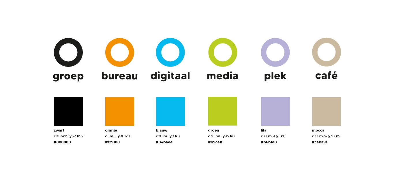
O-groep is a collective of creative businesses, each operating in a different area within the (creative) communication field. O-groep is currently made up out of three labels (O-bureau, O-plek and O-café). In the near future, they are planning to extend their business by adding two new labels (O-media and O-digitaal). Although these businesses do operate separately, the strength of O-groep is synergy. Each business adds value to another, which leads to expressive designs for meaningful brands.
Business goals _______
Strengthen the brand's image and increasing brand awareness.

After performing a usability test with the current website, the problem occurred that users did not understand the cohesion between the different labels. The reason being inconsistent logo usage, poor communication of the 'why' and 'how' and lack of consistency. Also, users found it hard to navigate through the website.
User goals ____
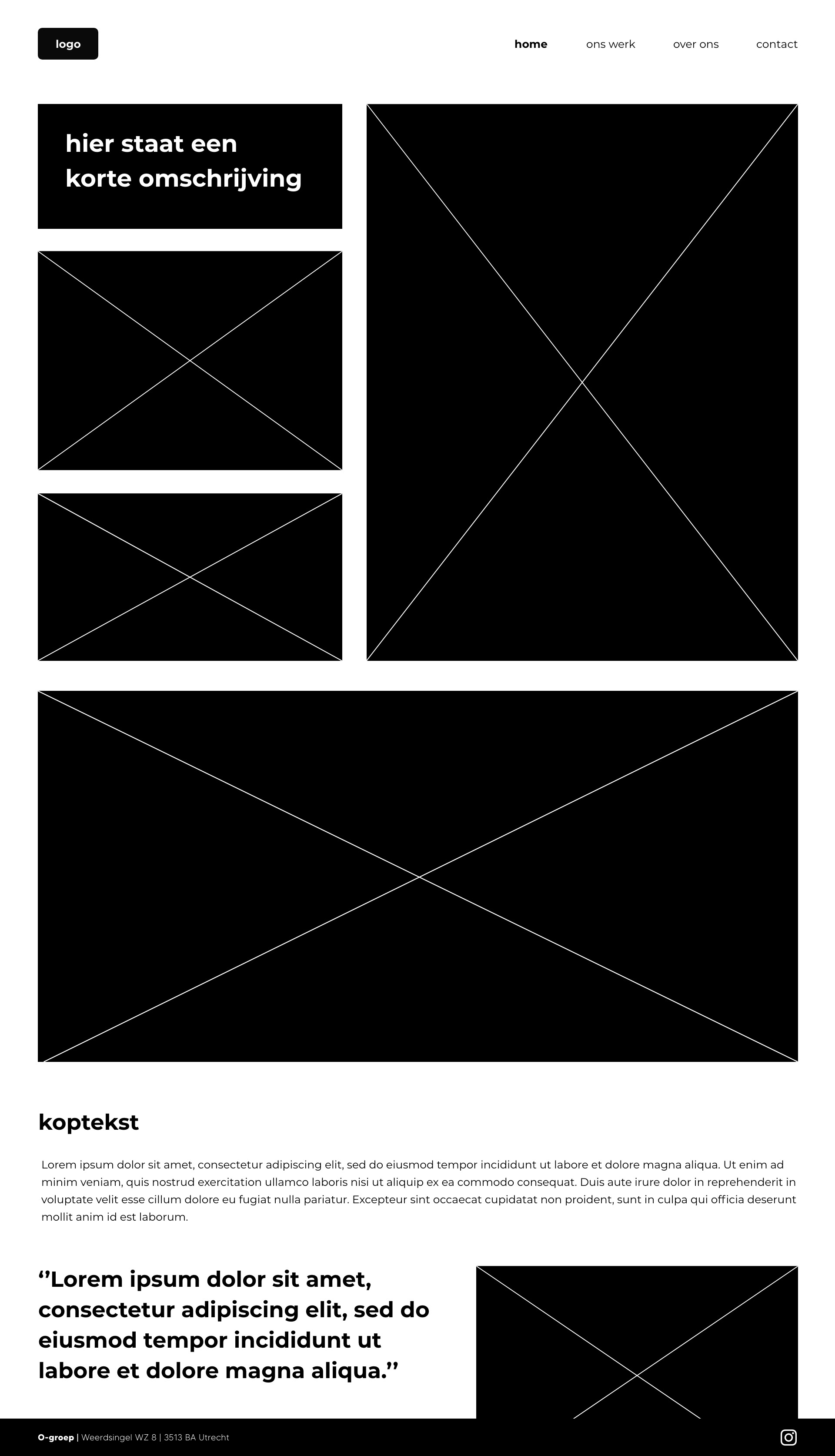
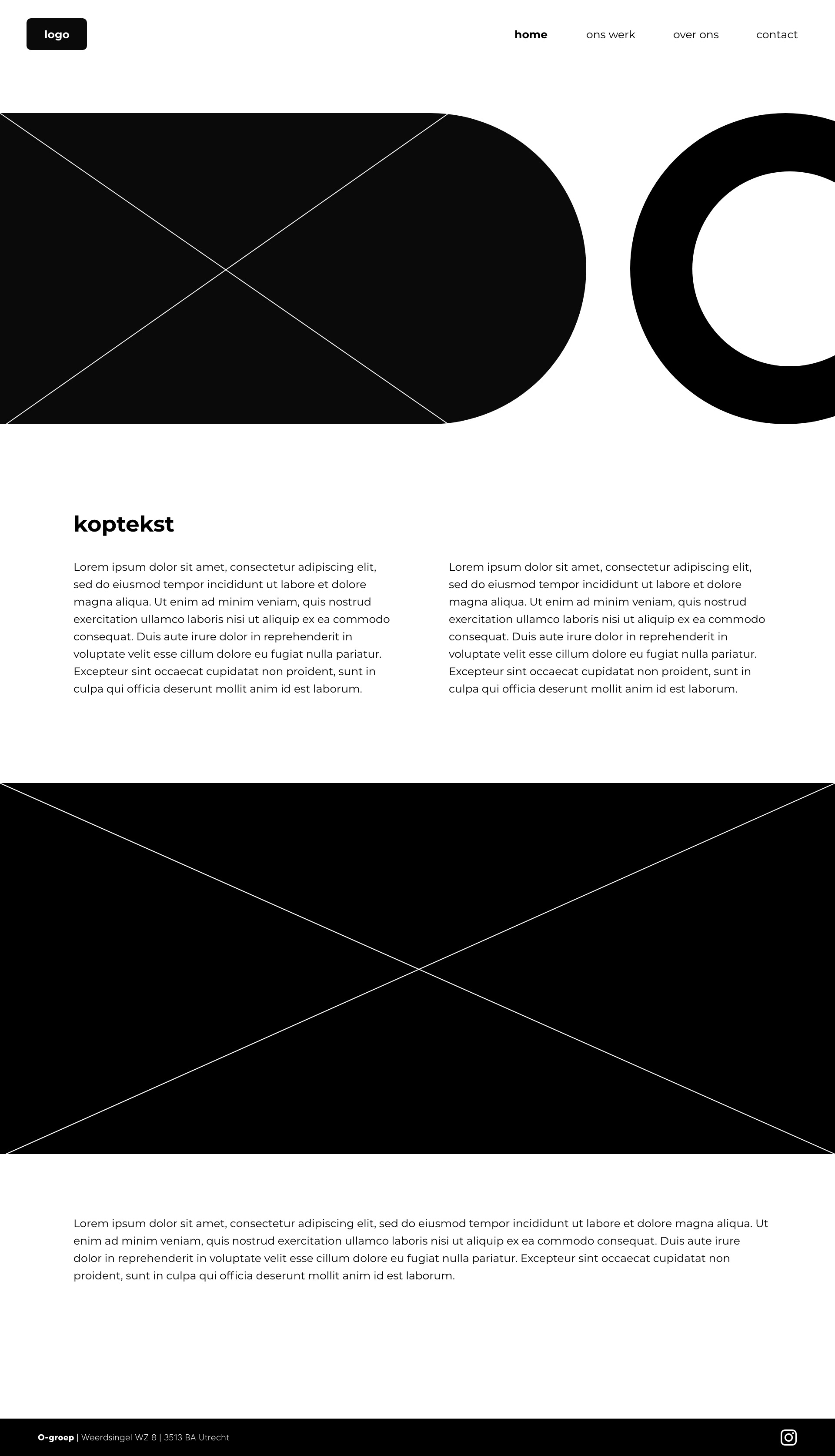
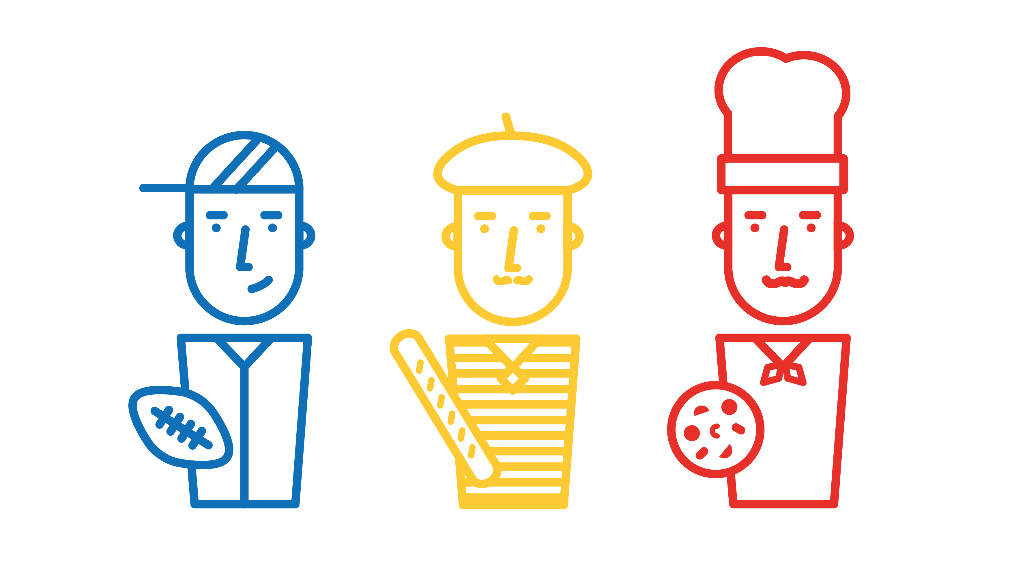
The website is meant to inform visitors about O-groep and its labels. It is a one-pager, so that navigating through the website is easy. First, the visitors are introduced with O-groep. Next, they learn more about the 'why' and 'how'. In addition to the logos of each label, a tagline was added.
O-bureau: creators of ideas
O-media: attention for ideas
O-plek: place for ideas
O-café: fuel for ideas
O-media: attention for ideas
O-plek: place for ideas
O-café: fuel for ideas
By bringing back 'ideas' consistently in each tagline, the cohesion between the different labels becomes clear to the user.
Results _______
In contrast to the current website, the new website proved to be very user-friendly. By narrowing down the overwhelming amount of information, the story of O-groep is much more clear. The reason being the consistency in both the design of the logo and the tagline, and a logic display of the brand architecture. Apart from the users, the founders of O-groep were also very pleased with the final design: ''Finally, our vision has come to life. A simple but brilliant solution for a complex communication problem''.
In contrast to the current website, the new website proved to be very user-friendly. By narrowing down the overwhelming amount of information, the story of O-groep is much more clear. The reason being the consistency in both the design of the logo and the tagline, and a logic display of the brand architecture. Apart from the users, the founders of O-groep were also very pleased with the final design: ''Finally, our vision has come to life. A simple but brilliant solution for a complex communication problem''.